Open
Collaborative
Making
A digital perspective. As part of V&A Digital Design Weekend 2014

Microsoft Research
Tim Regan — David Sweeney
Reclaiming Charts: of Physicality and Small Data
These days ‘Big Data’ is a big issue. From our daily newspapers to new scientific journals and from TV and radio to blogs, the proliferation of data and the proliferation of new techniques for grappling with that data is presented as a new horizon in our understanding of ourselves and our understanding of the world we live in. These datasets are vast and varied: census results, local statistics on crime, education, property prices, our shopping habits, our tweets and Facebook likes, scientific measurements, etc. If we are to believe the hype, these data sets and more besides, are enabling unprecedented access to who we are as individuals and citizens, what we want, and even the very nature of knowledge.
But with each new advance in the amount of data we can glean, store, analyse and present, the questions we seem to pose of our datasets and the techniques we use to find and present our answers become increasingly removed from the everyday experiences of data and our naïve ways of understanding it.
To redress the gap between the promises of the Big Data paradigm and the day-to-day experience of the data, we have been working with a local community to understand what the idea of ‘data’ means to people and what they hope it might be able to do for them. The street running next to our lab in Cambridge, Tenison Road, runs from Cambridge Station up towards Anglia Ruskin University; it is this community, a community we at Microsoft Research form a part of, who we are working with to comprehend these everyday understandings of data, ‘small data’ if you will.
Several classes of data emerge as important in the community. There is data that helps us negotiate better facilities and protect our environment. Traffic volume and speed, for example, is of particular concern at present to this community. Similarly measuring the effect that traffic and building projects have on air quality indicators provides data that is useful in discussions with the council about local traffic calming provisions.
Another interesting set of data points are those that help us tell stories about the places we live. Residents have been working with us to collect a historic archive of the street; we have also been looking at mapping as a way to record textured local knowledge.
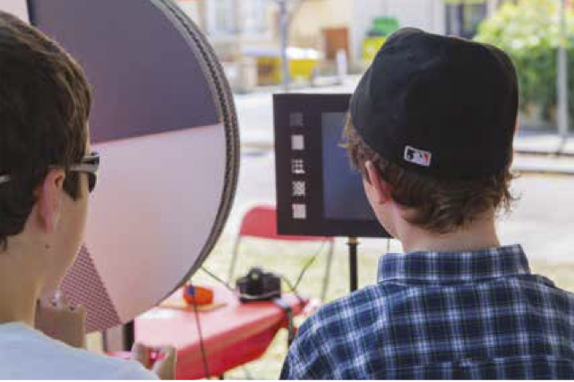
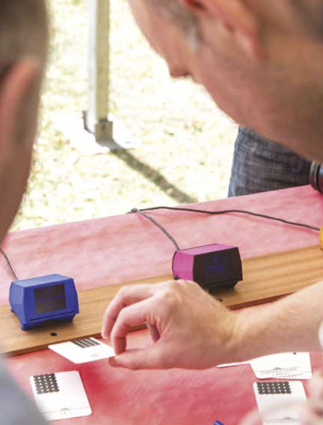
Then there are the questions we would like to pose of each other. Questions relating to local issues like the provisioning of new street signs through to pragmatic issues like borrowing a ladder, or questions that help to paint a picture of the space a community lives in, like which garden gets the first snowdrop. To facilitate these questions within our project we have designed a device that residents can use to both pose and answer questions. We have conceived and built this as a small, dedicated device, though much of the functionality could readily be achieved within a web page or a smartphone app. Instead, creating a physical artefact allows us to keep the relationship between us and our data in the foreground during the project.
With big or with small data the techniques that we use to look at the information are crucial in prescribing exactly what we can learn from and do with data. These techniques may be designed to help us discover things within the data: trends, patterns or answers to questions we have posed; or they may be designed to help us tell stories about or using the data. Some of these techniques in use are very old, the first pie chart for example can be traced to 1801, and some are cutting edge inventions, such as those used to visualise bioinformatics data. One bene t of such advances is that increasingly complex data can be examined, but one drawback is that the charts themselves become less legible and the preserve of data experts. Simple charts become almost too commonplace and fail to stand out.
One way beyond this dilemma is to stay true to the simplicity of charting ideas like pie charts and line graphs, but render them physically rather than presenting them on screen or in print. The presence of such charts makes them stand out and helps us to present the data we are collecting with residents back into the community, where the data is of interest.