Big Data in the Arts and Humanities
Big Data in the Arts and Humanities: Some Arts and Humanities Research Council Projects

Seeing Data, Feeling Numbers: responding emotionally to data visualisations
What happens when a person looks at a data visualisation? Not an expert in data visualisation looking at a specialist visualisation, but an ordinary person encountering a visualisation as part of everyday life – online, in the newspaper, on TV, or elsewhere. On Seeing Data, we asked this question because data are increasingly assumed to have the power to explain our social world and used to inform decision-making by governments and businesses that affects us all. However, it’s difficult for non-experts to comprehend large datasets, what they mean and what they do. As long as that remains true, the ability to engage in conversations and decision-making involving large-scale data will remain off limits to certain groups.
Visualising data (in charts and graphs) is one possible way of addressing and overcoming these issues, as they are thought to promote data transparency and awareness. But until recently, not much was known about how we engage with data visualisations. So on Seeing Data, through focus group research, interviews, diary-keeping and other methods, we explored how people engage with data visualisations in everyday settings. We found that a range of socio-cultural factors affect how and whether people engage, but one in particular – the emotions or feelings stirred up through viewing – really stood out. These included feelings about: visualisations as visualisations (enjoyment of their beauty, frustration at their lack of interactivity); what the data were revealing (‘crime levels are increasing in my region and I felt worried’); the subject matter (‘I hate Shakira and Rihanna and think this visualisation about their social media statistics is garbage’); or the source (‘I love Buzzfeed so much that I think I’m addicted to it!’)
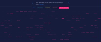
At a focus group involving people from a non-governmental organisation, the experiences of two participants (who chose the pseudonyms Sally and Horace) provide us with a very poignant example. They had spent some time looking at a number of visualisations, including one that displayed the kinds of words typically used to describe migrants in the British national press from 2006 to 2013. (This dataset was collected and used by the Centre on Migration, Policy, and Society at the University of Oxford).

Image: Visualisation of words typically used to describe migrants in the British national press from 2006 to 2013
After looking at the visualisation, Sally and Horace told us how they felt. They described feelings of guilt and shame that the visualisations had evoked: how must people feel, coming to the UK, perhaps from war zones or countries where they had been persecuted, only to see themselves represented in the press as ‘bogus’, ‘failed’, ‘illegal’? Sally and Horace felt ashamed to be associated with such demonising language of fellow humans in need. Although the visualisation was intended to be unbiased, the visual ‘weight’ of the words – their quantity and their communicative strength – powerfully evoked empathy and intense emotions. Hearing them talk about their emotions was extremely moving for us as researchers: one of us, Rosemary, found herself choking back tears as she witnessed how they felt.
What happens when a person looks at a data visualisation? They use their numerical skills to try to understand it. But other factors, including emotional responses, also influence how people make sense of data. We call this ‘the feeling of numbers’. The feeling of numbers raises questions about how people learn to relate to data through both formal education and informal cultural practices. Since people relate to statistics emotionally as well as cognitively and rationally, we might need to re-think existing scientific approaches to statistical education and consider how softer, arts-based approaches might contribute to developing skills for feeling confident with data.
After all, whilst visualisations are seen as being powerful tools for informing minds, our experience on Seeing Data has shown us that they also have the power to change hearts.
Research team: University of Sheffield: Helen Kennedy; University of Oxford: William Allen; University of Leeds: Rosemary Hill; Visualising Data: Andy Kirk